A secret within a secret...
When it comes to photography, I'm with Diane Arbus - A photograph is a secret about a secret. The more it tells you the less you know.
One photographer that creates beautiful wonderful secretive images better than most is the deeply talented Erik Madigan Heck.
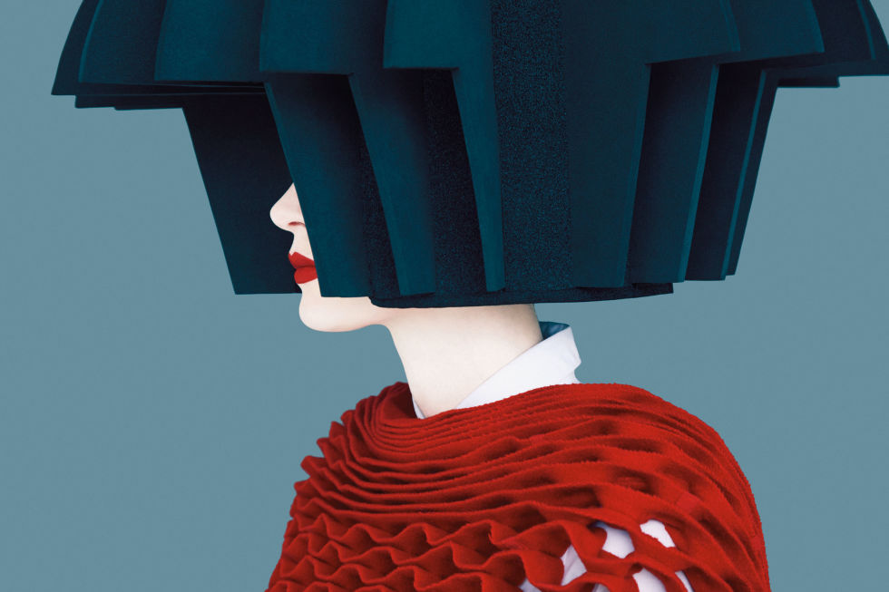
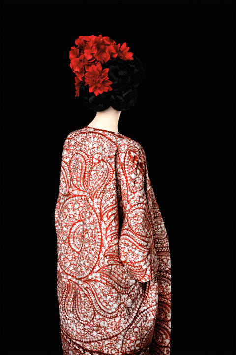
In contemporary fashion photography, Heck is something of an anomaly – a very successful anomaly who steers his own path. His work is elegant and unashamedly beautiful, exploring the intersections of fashion, painting and classical portraiture.
Working with natural light and combining in-camera effects with digital post-production, he produces evocative and seductive images that are simultaneously timeless and futuristic. Thames and Hudson have just published Erik Madigan Heck: Old Future
It presents more than 100 photographs in a flowing, chromatic sequence. With essays by Susan Bright and Justine Picardie that look at Heck’s place within the realms of both art photography and fashion, and with an index to the photographs captioning the piece, model, designer, collection or publication in which each image appeared.
He celebrates beauty in an industry in which, he’d argue, beauty is especially difficult to address. His work’s otherworldly nature—achieved by pairing an uncanny flatness with vibrant contexts—rises to the occasion. Using highly saturated hues, the 33-year-old fuses models, whose backs often face the camera, with their surroundings in a pure, nonhierarchical manner that brings the entire picture to life. His images blur the lines between painting and photography; many were captured with the same lens his artist mother gave to him when he was 14...
I try to represent women in a way where they aren’t sexualized. I feel we should present women as beautiful, as opposed to being sex objects. I always propose to magazines doing stories where we don’t see the face, even though very few publications have said yes. By removing that one element, people start noticing everything else in the picture.
My work is equally as commercial as it is personal, or artistic. I’ve found it to be much more rewarding to compose an image that functions as both. When you make really beautiful commercial images while being able to instill your ethical ideals into that setting, it’s almost more rewarding in a way because you’re up against so many variables to get there. If you can make it through that and still have a striking image, you’ve done well.
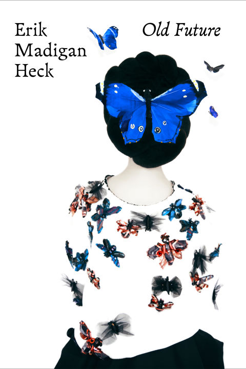
Much as I adore his work, am I the only one disappointed with the book cover?
Have they kept it purposely lo key, all the better for the glory within to burst forth once you open the pages.
But I can't help but feel they missed a trick.
And yes Queen Michelle before you say it, he looks right up my street!
Queen Marie


